
Responsive Mobile Friendly Design
home > services > web design > mobile websites / RWD
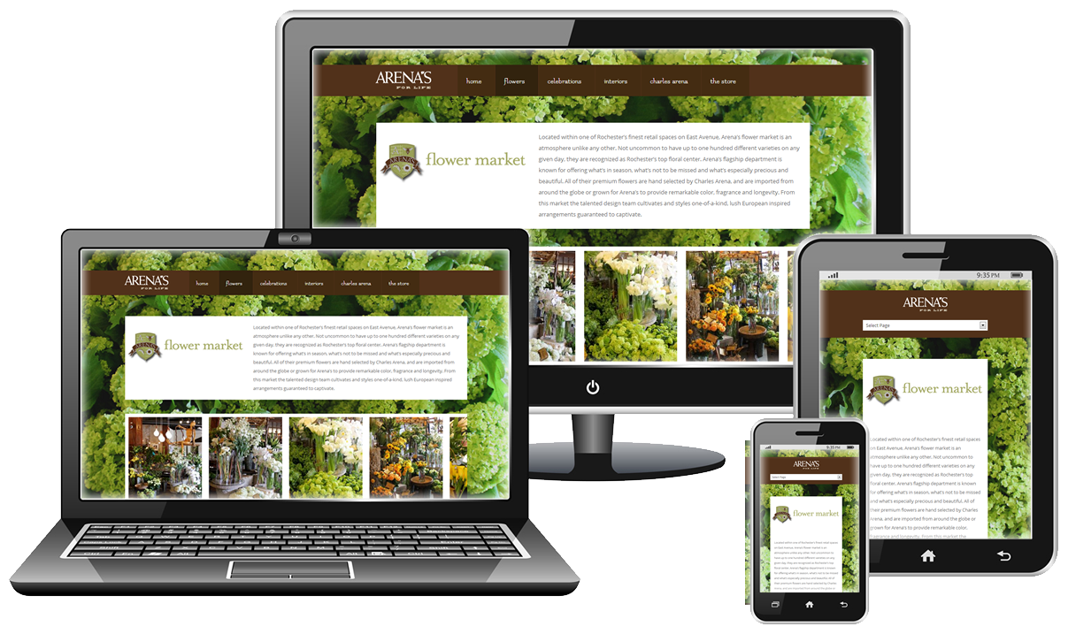
Mobile Website Design
Mobile or responsive website design (RWD) is a web design method which provides optimal viewing experiences across a wide range of devices (desktop computer monitors, mobile smart phones and tablets).
When a user switches from their desktop to a tablet, to a phone, responsive websites automatically switch to accommodate for resolution, image size and scripting abilities. RWD has the technology to automatically respond to the user's preferences. This eliminates the need for a different design for each new device on the market.
We help ensure that your website adapts to your customers mobile device. Regardless of screen size, operating system or platform.
- Larger font sizes for readability
- Dynamic resizing of images
- Simplified navigation for improved usability
- Streamlined page rendering over mobile networks
Costs
Our "Responsive Redesign" services for a typical small business website (8-10 pages) starts at $1000.
The user has the ability to manually switch between display modes (desktop or mobile).
Get Responsive Design Quote // Web Development Gallery // Search Engine Optimizing
We Get Results
Contact us for more information.