home > services > web design > user centered design
We use the following standards based Web design principles in all of our projects...large & small:
Used with permission from WEB STYLE GUIDE, 2nd edition (Copyright 2002 Lynch and Horton).
Graphic user interfaces were designed to give people control over their personal computers. Users now expect a level of design sophistication from all graphic interfaces, including Web pages. The goal is to provide for the needs of all your potential users, adapting Web technology to their expectations and never requiring readers to conform to an interface that places unnecessary obstacles in their paths.
This is where your research on the needs and demographics of the target audience is crucial. It's impossible to design for an unknown person whose needs you don't understand. Create sample scenarios with different types of users seeking information from your site. Would an experienced user seeking a specific piece of information be helped or hindered by your home page design? Would a casual reader be intimidated by a complex menu scheme? Testing your designs and getting feedback from a variety of users is the best way to see whether your design ideas are giving them what they want from your site.
Clear navigation aids | No dead-ends | Direct access | Bandwidth & interaction | Simple & consist | Design integrity & stability | Feedback & dialog
Clear navigation aids
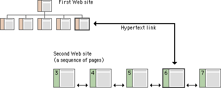
Most user interactions with Web pages involve navigating hypertext links between documents. The main interface problem in Web sites is the lack of a sense of where you are within the local organization of information:

Clear, consistent icons, graphic identity schemes, and graphic or text-based overview and summary screens can give the user confidence that they can find what they are looking for without wasting time.
Users should always be able to return easily to your home page and to other major navigation points in the site. These basic links should be present and in consistent locations on every page. Graphic buttons will provide basic navigation links and create a graphic identity that tells users they are within the site domain.
- top -
No dead-end pages
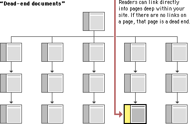
Web pages often appear with no preamble: readers can make or follow links directly to subsection pages buried deep in the hierarchy of Web sites. They may never see your home page or other introductory site information. If your subsection pages do not contain links to the home page or to local menu pages, the reader will be locked out from the rest of the Web site:

Make sure all pages in your site have at minimum a link back to the main "home" page or, better yet, a home page link along with links to the other sections of the site.
- top -
Direct access
Users want to get information in the fewest possible steps. This means that you must design an efficient hierarchy of information to minimize steps through menu pages. Studies have shown that users prefer menus that present at least five to seven links and that they prefer a few very dense screens of choices to many layers of simplified menus. The following table demonstrates that you do not need many levels of menus to incorporate lots of choices:
|
Number of menu items listed |
||||
|---|---|---|---|---|
|
Number of nested menus |
5 |
7 |
8 |
10 |
|
1 |
5 | 7 | 8 | 10 |
|
2 |
25 | 49 | 64 | 100 |
|
3 |
125 | 343 | 512 | 1000 |
Design your site hierarchy so that real content is only a click or two away from the main menu pages of your site.
- top -
Bandwidth and interaction
Users will not tolerate long delays. Research has shown that for most computing tasks the threshold of frustration is about ten seconds. Web page designs that are not well "tuned" to the network access speed of typical users will only frustrate them. If your users are primarily general public browsers "surfing" the Web via dial-up modem connections, it is foolish to put huge bitmap graphics on your pages — the average modem user will not be patient enough to wait while your graphics download over the phone line. If, however, you are building a university or corporate intranet site where most users will access the Web server at Ethernet speeds or better, you can be much more ambitious in the use of graphics and multimedia. Many home computer users can now use high-speed DSL (digital subscriber line) or cable modems to access the Web. However, industry observers expect that it will be at least another five years before Web designers can count on most home users having access to high-speed Web connections. In general, be conservative with Web graphics. Even users with high-speed connections appreciate a fast-loading page.
- top -
Simplicity and consistency
Users are not impressed with complexity that seems gratuitous, especially those users who may be depending on the site for timely and accurate work-related information. Your interface metaphors should be simple, familiar, and logical — if you need a metaphor for information design, choose a genre familiar to readers of documents, such as a book or a library. Highly unusual, "creative" navigation and home page metaphors always fail because they impose an unfamiliar, unpredictable interface burden on the user.
The user interface for your Web site should follow the general navigation and layout conventions of major Web sites because your users will already be used to those conventions. Users spend most of their time on sites other than yours, so avoid highly unusual interfaces if you wish to attract and keep a large audience.
The best information designs are never noticed. An excellent model of interface design is the Adobe Corporation Web site. Graphic headers act as navigation aids and are consistently applied across every page in the site. Once you know where the standard links are on the page header graphics, the interface becomes almost invisible and navigation is easy.
For maximum functionality and legibility, your page and site design should be built on a consistent pattern of modular units that all share the same basic layout grids, graphic themes, editorial conventions, and hierarchies of organization. The goal is to be consistent and predictable; your users should feel comfortable exploring your site and confident that they can find what they need. The graphic identity of a series of pages in a Web site provides visual cues to the continuity of information.
Even if your site design does not employ navigation graphics, a consistent approach to the layout of titles, subtitles, page footers, and navigation links to your home page or related pages will reinforce the reader's sense of context within the site. To preserve the effect of a "seamless" system of pages you may wish to bring important information into your site and adapt it to your page layout scheme rather than using links to send the reader away from your site (be sure there are no copyright restrictions on copying the information into your site).
- top -
Web Design integrity and stability
To convince your users that what you have to offer is accurate and reliable, you will need to design your Web site as carefully as you would any other type of corporate communication, using the same high editorial and design standards. A site that looks sloppily built, with poor visual design and low editorial standards, will not inspire confidence.
Functional stability in any Web design means keeping the interactive elements of the site working reliably. Functional stability has two components: getting things right the first time as you design the site, and then keeping things functioning smoothly over time. Good Web sites are inherently interactive, with lots of links to local pages within the site as well as links to other sites on the Web. As you create your design you will need to check frequently that all of your links work properly. Information changes quickly on the Web, both in your site and in everyone else's. After the site is established you will need to check that your links are still working properly and that the content they supply remains relevant.
- top -
Feedback and dialog
Your Web design should offer constant visual and functional confirmation of the user's whereabouts and options, via graphic design, navigation buttons, or uniformly placed hypertext links. Feedback also means being prepared to respond to your users' inquiries and comments. Well-designed Web sites provide direct links to the Web site editor or Webmaster responsible for running the site. Planning for this ongoing relationship with users of your site is vital to the long-term success of the enterprise.
- top -
We Get Results
Contact us for more information.
